ResearchMaps.org
I gave this talk at UCLA’s 2nd QCBio Symposium, 28 April 2017. Below is a transcript of my talk.
A major task in science is to ask, “Which experiment do we perform next?” When biologists ask this question, they need to tackle a different kind of big data than the one we’re usually used to thinking about.
What I’m referring to is:
- the enormous space of causal interpretations of a set of evidence, and also
- the enormous space of potential experimental designs we could pursue.
I want to emphasize this: This space can be very large even if what we’re dealing with is not traditionally “big data.” Even for a personally curated knowledge base, the set of papers that a scientist might base his next experiment on, it can be a very large space.
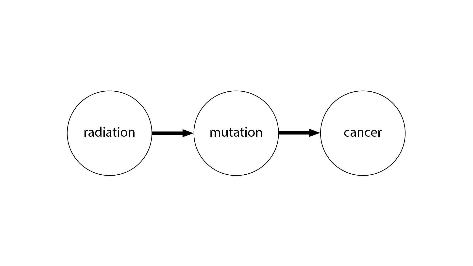
One way to illustrate this is with the idea of causal graphs. Even if you’re not familiar with causal graphs, this picture will probably make some sense to you. We have radiation causing a genetic mutation, and the genetic mutation causes cancer. This is very straightforward.
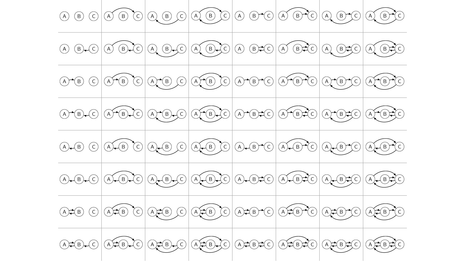
But what’s more humbling is the case where, let’s say, we have three variables, and we don’t know the causal structure between them. In theory, there are 64 possible causal graphs over three variables—a very large space.
This number actually grows super-exponentially in the number of variables. So by the time we get to something like 20 or 30 variables, there are more causal graphs to choose from than there are atoms in the universe. That’s in theory.
In practice, it’s not quite so bleak because biologists employ a lot of domain knowledge to constrain this model space. But there are still a lot of interpretations to consider. The question is: Can we operationalize this?
With ResearchMaps, we ask the question: What would it mean to navigate a space like this—not necessarily causal graphs, but the space of possible experiments we could do, the space of possible interpretations we could take—what would it mean to navigate this space systematically, or intelligently, or automatically, even?
We ask this question in response to what we see to be a very glaring asymmetry in science, which is that we have very rigorous statistical methods for showing that our findings are significant, but we don’t have any analogous procedure for showing that our planned experiments are optimal. So what would a mathematics of experiment planning look like?
It seems that a solution to this problem would incorporate at least two features. One is giving the biologists an intuitive visualization of the evidence that they can navigate and explore. The second is providing a very clear demarcation between what we believe based on empirical evidence, and what we believe just based on a synthesis of the findings, or sheer conjecture, or background assumptions. So with ResearchMaps, we try to provide both features.
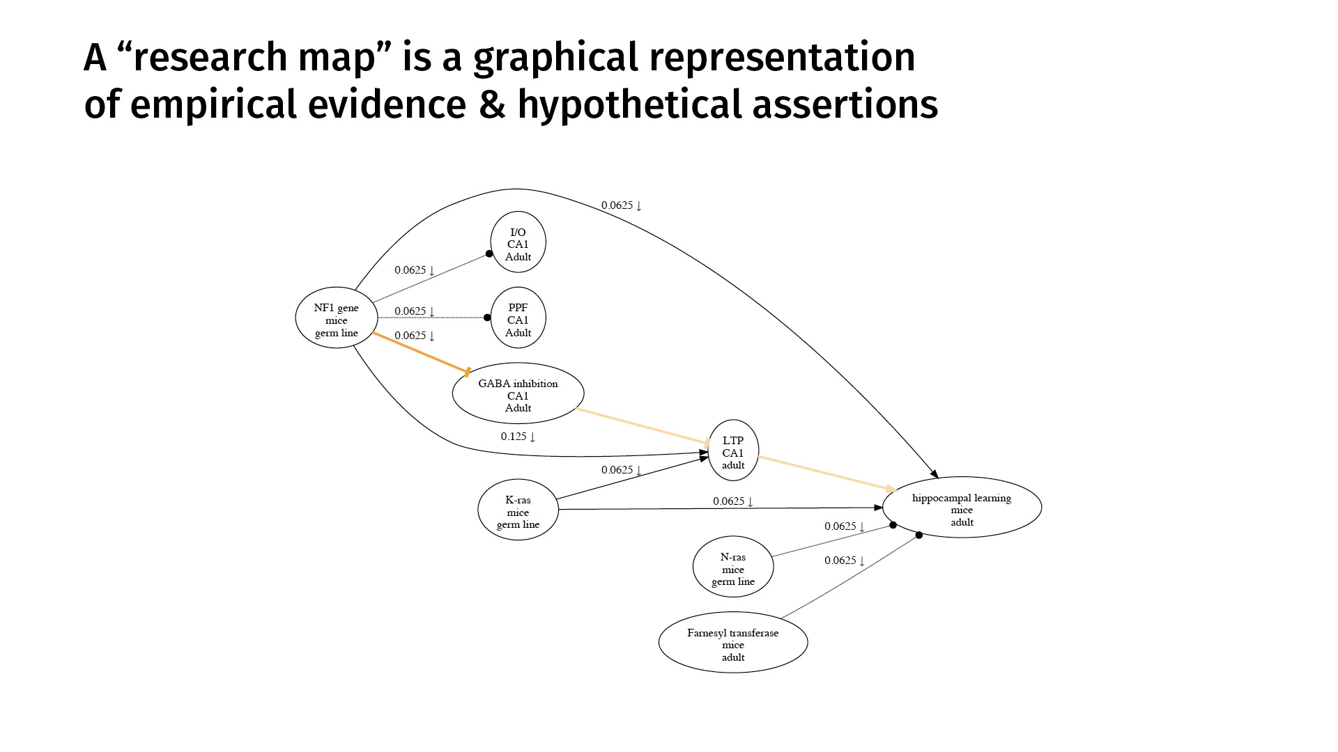
This is an example. A research map is a graphical representation of empirical evidence and hypothetical assertions. The nodes represent phenomena that we’re studying. The edges represent purported relations between those phenomena.
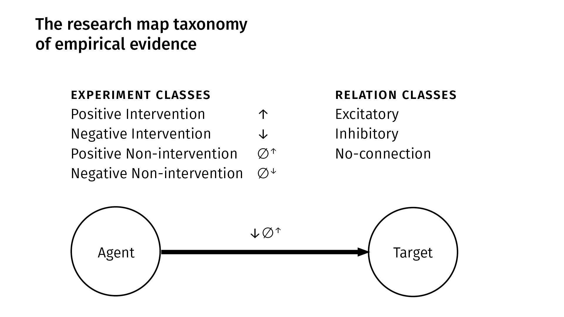
A research map’s concision derives mostly from the simple taxonomy we use to categorize scientific evidence. This is a very high level of abstraction, but it captures much of biology.
We have four kinds of experiments; there are [two kinds of] interventions and [two kinds of] observations (non-interventions). In an intervention, we manipulate some agent and then look at its purported effect on a target. In a non-intervention, we simply passively observe [an agent in] the system and then see how a target responds (or doesn’t). Within each of those classes, we have positive and negative [versions]: positive simply means that the quantity or probability of the agent increased—either through intervention, or we just observed it to be so—and in the negative case, the quantity or probability of the agent decreased.
From these four kinds of experiments, we derive three kinds of qualitative relations. Between an agent and a target, there can be:
- an excitatory relation, meaning more of the agent [leads to] more of the target, or less of the agent [leads to] less of the target;
- an inhibitory relation is just the opposite of that—if you increase the agent, the target will decrease (and vice versa);
- and we explicitly represent what we call a no-connection edge—an explicit independence between the phenomena—to indicate that we have done an experiment where we found no connection between the entities.
In this example at the bottom [of the slide above], we can see, based on the experiment symbols that we use, that between this agent and target we’ve done a negative intervention experiment, and a second experiment which was a positive non-intervention. And we’ve derived an excitatory finding.
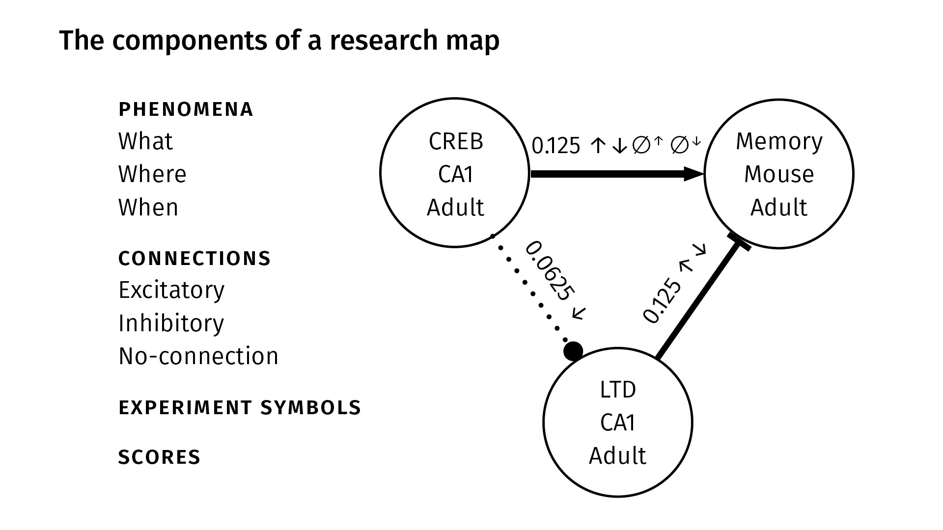
These are all the components in a research map. We identify nodes with three properties, very generally:
WhatWhereWhen
The What just gives a taxonomic identity to the node—it might be the name of a protein like CREB, or the name of a behavior like spatial learning. The Where locates the phenomenon in space—maybe it’s the CA1 region of the hippocampus, for example. And the When locates the phenomenon in time—maybe the experiment happened in adult mice.
Of course, this is very general; that’s because we’re trying, as a first pass, to accommodate a lot of different kinds of scientific evidence. But in principle, you could link this up with any ontology. Our web app, for example, is linked to the [Neuroscience Information Framework] (NIF) Neurolex lexicon of neuroscience terms. But you could plug anything into the nodes you want. Really, the emphasis is on the epistemological knowledge encoded by the edges.
So again—between any two nodes, we have three kinds of connections:
- excitatory, which we show with a sharp arrowhead;
- inhibitory, which we show with a flat arrowhead; and
- no-connection, which we show with a dotted line and circular arrowhead.
The experiment symbols, as before, show the kinds of experiments that were done. You can see between CREB and memory (at the top), we’ve done all four kinds of experiments; between CREB and LTD, we’ve only done a negative intervention.
Finally, we have scores. The scores are not probabilities; they’re our attempt to quantify the amount of evidence that we have from the literature for a given pair of phenomena.
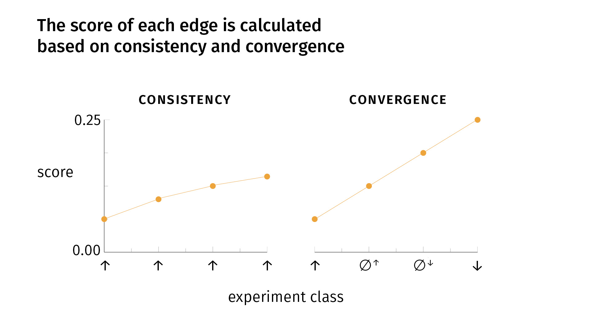
I don’t have time to go into a full derivation, but I can tell you that we use a Bayesian method to calculate the scores, and the scores were designed to capture two epistemological principles in biology which are used very commonly. But often they’re used implicitly, so we’re trying to operationalize them and express them mathematically.
Those principles are:
- consistency
- convergence
Very simply, consistency says that it’s good to do the same kind of experiment multiple times, to replicate your findings and to get the same result. If that happens, your confidence grows [as you see on the slide]. But there’s a decay, because the fiftieth iteration of an experiment is not necessarily as informative as the second iteration. So there’s some sort of decay.
Convergence says that, in addition to replicating your findings, it’s good to do different kinds of experiments, for the simple fact that one of your experimental methods (or more) might be biased; the effect you’re seeing might be an artifact of the experimental design. We try to mitigate that risk by doing different kinds of experiments. If we see convergent results, we become more confident. With convergence, our score grows faster than [it does] with one kind of experiment alone. But again, there’s a decay: [the growth] is linear for the first four experiments, but for each round of the four types of experiments, we’ll see a lowering slope.
So a key point is that with conflicting evidence—whether it’s inconsistent or divergent—we’ll have a lower score. Consistent and convergent evidence will increase our score; conflicting evidence will lower it. And the edge that we visualize—whether it’s excitatory, inhibitory, or no-connection—is simply the edge relation for which there is the most evidence.
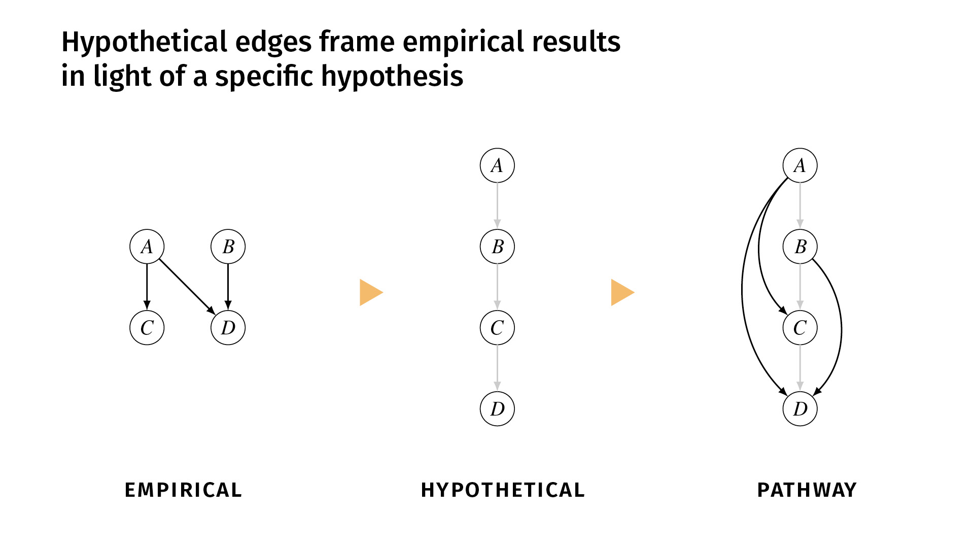
I said earlier that it’s important to distinguish between the relations that we’ve shown empirically and the relations that we simply hypothesize. In ResearchMaps, we do that explicitly with hypothetical edges.
These are edges that are shown in a lighter color, and we don’t assign a score to them because they don’t have any empirical evidence behind them. But they simply help to structure the empirical evidence, or to contextualize the empirical evidence in a framework of some overarching hypothesis.
Let’s say, for example, that we’ve done a few studies, and we find excitatory effects between A and C, A and D, and B and D. But the background hypothesis is that the pathway actually runs A, B, C, D. But maybe we don’t have the tools necessary to do experiments to demonstrate those direct edges. So we would enter those hypothetical edges into the research map, and now we can view the empirical evidence in the pathway (the third diagram) alongside the hypothesis. If you disagree with the hypothesis, you can change it and see how that would change the network structure.
Everything I’ve shown you up to this point can be done very simply with pen and paper. But, of course, as your knowledge base grows, it becomes increasingly impractical. So we’ve developed a web app, ResearchMaps, which you can access at ResearchMaps.org. It’s free. We have, currently, around 600 users across four continents. And it’s just simply a web application for making research maps and querying the research maps that you create and the public research maps of other collaborators (other users).
There are two main pages in the system.
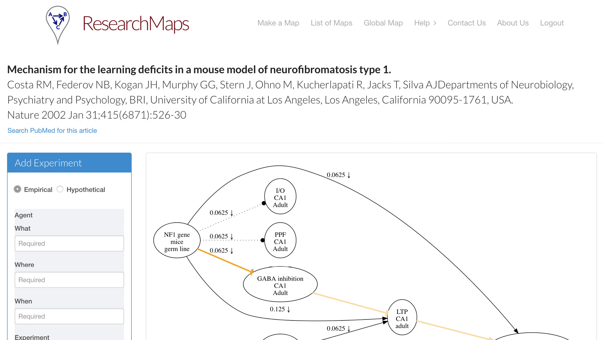
One is what we call the article page. For each article that you map, each article for which you create a research map, you can have a dedicated page. This is one example of an article from Nature. On the left, we have a simple form for inputting all the fields that I just enumerated for you. It doesn’t take that much more time [to enter this information]. It is currently [a manual process], but people actually find it quite instructive to go through the exercise—even with papers that you think you know quite well—to actually go through this taxonomy and enter the evidence that it actually encodes. A research map will be drawn for you, which can encode one or more experiments on each edge.
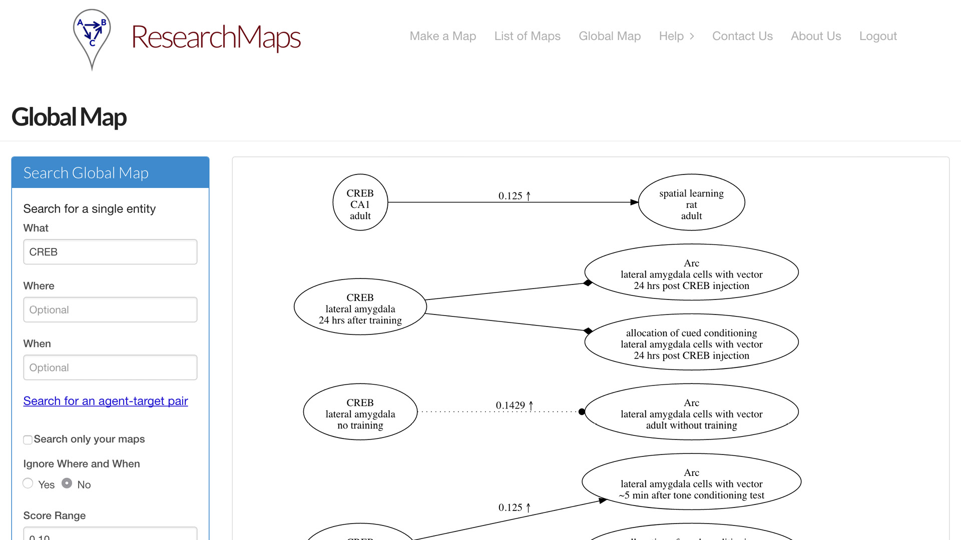
Having entered a bunch of papers, now you might want to query the entire map that you’ve entered. So we concatenate all the maps you’ve entered and the maps of other users. You can query those maps in a global map. You can search for a specific phenomenon. You can search for a specific relation between two phenomena. Or you can search for ranges of evidence; maybe you’re only interested in edges for which there is very little evidence, or a significant amount of evidence.
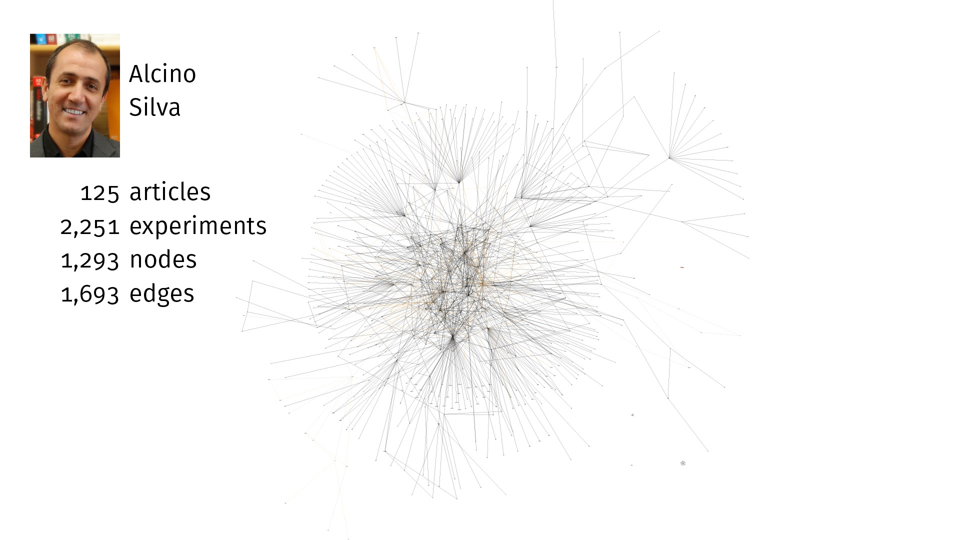
Alcino Silva, who invented research maps, has been using this system for a number of years. It’s amazing how large this knowledge base can grow. Most of the time now, when he reads a paper, he’ll enter it into ResearchMaps, which takes only a little extra time. And just in the field of memory allocation and some related literature, here we have 125 articles, over 2,000 experiments, over 1,000 nodes, over 1,600 edges. This is a very rich global map that he can query for specific features.
Again, it’s not just the ontological information about what these things are and what they’re doing, but the epistemological information: How did we come to know these findings? We can now quantify what percentage of the experiments are interventions versus observations. Where have we not done a negative intervention where we might want to do one?
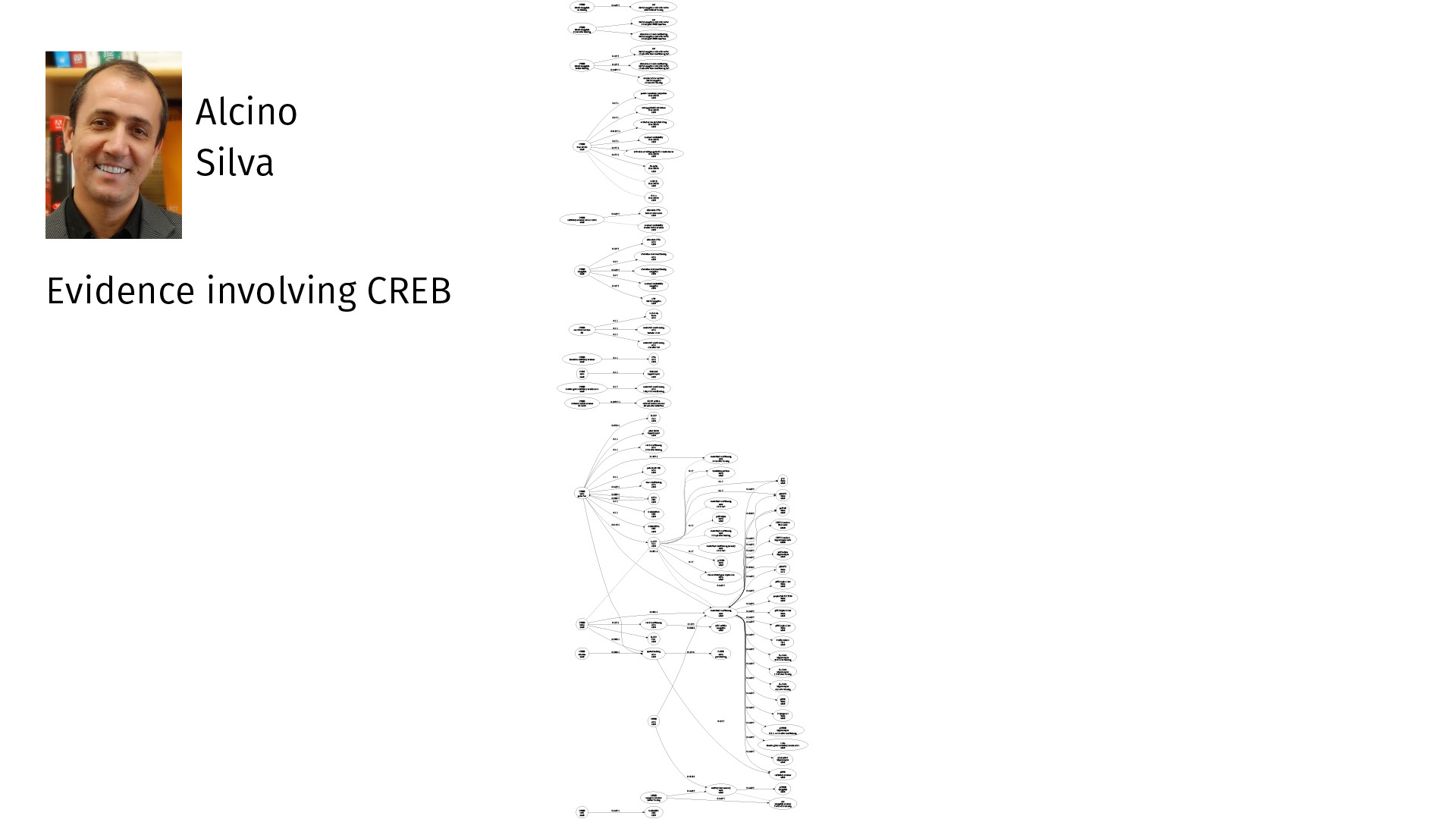
Here is all of his evidence only involving CREB, just one specific node. So you can see—plenty to think about.
If you’re planning an experiment, holding this in your head is quite a task. But if you can visualize it in a way that you can navigate, it becomes much more easy.
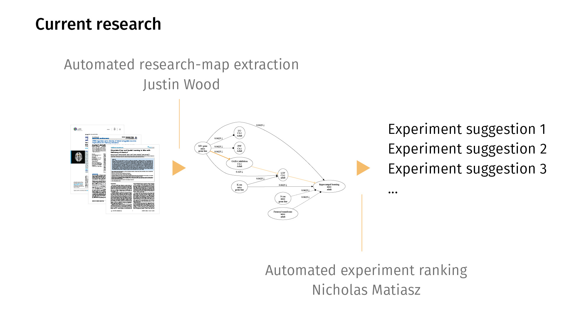
In current work, we’re trying to extend this workflow in both directions. By that I mean that right now, entering the maps is [a manual process], but we’d love to automate it so we can just map all of PubMed, for example. My colleague Justin Wood in Computer Science is looking at ways to automatically extract research maps from PDFs. You would just feed the system a bunch of PDFs; it would generate a map for you. Likely, the map would be noisy, but then you could then just simply edit the map in a supervised sense, rather than having to create one from scratch.
On the other end, I’m working on automated experiment ranking, asking the question: Just as we have statistics for quantifying the significance of a finding, can we quantify the potential information gain of a new experiment? Given the current knowledge base that we have, what would it mean to rank experiments by how much information they could provide?
These are our collaborators. I’m happy to take any questions. Thank you.
⁂
Subscribe to my mailing list if you’d like to read more.
